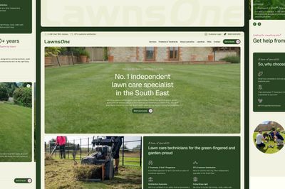
Modern Stack
Web Development
We use something called Jamstack to make sure your website is super safe, easy to manage, and can grow with your business.
You're in good hands
After years of experience in front-end development, we have developed a keen understanding of the narrative behind every design. This enables us to ensure that we adhere to established web design principles, with a focus on enhancing performance, accessibility, and usability.
-
Creative development
When it comes to developing a front-end, it's not just about picking a stack. It's about making sure every single detail aligns with the design and is carefully crafted from scratch. We take great care in prioritising these details to ensure we deliver top-notch builds.
-
Refined process
We've got years of experience under our belt and we use the best tools in the industry to make our development process as efficient as possible. Thanks to Netlify, we can create version-controlled code and preview URLs, and the built-in feedback tools really help us to stay on top of things.
-
Hassle-free
We specialise in creating top-notch websites using the latest and greatest technology available. We take pride in our work and strive to provide you with the best possible product. We don't use Wordpress or any of its associated plugins, updates, or security issues, ensuring that your site stays up and running smoothly. Our sites are built to last, providing exceptional performance, scalability, and security, making sure your online presence is the best it can be.
-
What We Do
Frontend
You want a website that looks amazing and works great on any device. Lucky for you, we're on top of the latest web technologies and can create beautiful, responsive websites that will make your online presence shine.
-
What We Do
Jamstack
We create websites that are not only quick but also reliable. We use the latest tools and technologies like Netlify and 11ty to make sure that our sites are super fast and provide a top-notch user experience.
-
What We Do
Headless
Headless offers incredible flexibility and control over the design and functionality of your site. It allows for statically driven sites that offer performance, security and scalability.
-
What We Do
API
Whether you need us to integrate with your current systems or create custom APIs, we always prioritise security and ease of use within the Jamstack ecosystem.
A truly fluid web
We understand that the internet is constantly evolving, and we believe that it should be sustainable, adaptable, and provide the best possible user experience. To achieve this, we prioritise cohesive design and development that ensures high quality, consistency, flexibility, and scalability. Drawing on our extensive experience, we specialise in delivering exceptional front-end design that elevates your project to new heights.
At our core, we prioritise adaptability and we always look to design websites with flexible layouts that adjust to various devices and screen sizes. This means that your website will look great and work perfectly, no matter what device your visitors are using. You won't have to worry about your website looking weird or not functioning properly on a tablet or smartphone. With our designs, your website will flow smoothly like water, so you can focus on what's important - your content.
-
Fluid type
We carefully design the typography using Utopia to achieve a perfectly balanced, fluid, and appropriately scaled typeface. This meticulous process leads to top-notch builds that are customized for the specific device.
-
Fluid scale
Combining fluid scale and fluid type can really help bring balance to your design and make it look great on any device!
-
Intelligence at heart
By developing building components that are aware of their context and size, we can create a more versatile, accommodating, and superior website. By using fancy CSS tricks, we can guide the web browser to make designs that are smart and easy to use, without making things too strict or complicated.
Progressive enhancement
Our aim is to make sure that everyone can enjoy a fantastic web experience, no matter what device or network they're using. We always use the latest technology to achieve this goal. We focus on creating great content and designs, and then we add more features to make the experience even better, as long as the device can handle it!
-
Built for all
Ensuring accessibility for all users, regardless of their device, browser, or internet connection, is made possible through progressive enhancement. Starting with a strong foundation and gradually adding enhancements, your website can provide a functional and engaging experience to a wider audience. This approach eliminates barriers and fosters inclusivity in your online presence.
-
Improved experience
Building a website using progressive enhancement can result in faster loading times and better performance. This is because it prioritizes the core functionality and minimal design, providing a more responsive experience for users, leading to increased satisfaction and engagement. Additional features and design elements are gradually added and optimized for performance, ensuring your website remains fast and user-friendly.
-
Future proof
Enhancing your website progressively can enhance its resilience to changes in technology and browser capabilities. This involves focusing on a sturdy core and gradually adding to it, reducing the likelihood of your website breaking or becoming obsolete when new technologies emerge. This method also streamlines maintenance by encouraging modular and well-structured code, making updates and troubleshooting more manageable when required.
Start a conversation
If you're interested in exploring the digital possibilities that Gittings Studio has to offer, feel free to contact us today. We'd love to chat with you!

